We’re thrilled to announce that our new big-screen interface is now available for Roku users in the Roku channel store, and it’s also now available as a beta for Apple TV!
The new UI represents months of hard work, extensive user testing, and ongoing conversation with our community. It’ll continue to be a focus of our efforts as we work to bring the new conventions to our other big-screen and mobile apps, but we’re super happy with the reception to date. Want to know more about how we got here? Read on, and we’ll give you the backstory…
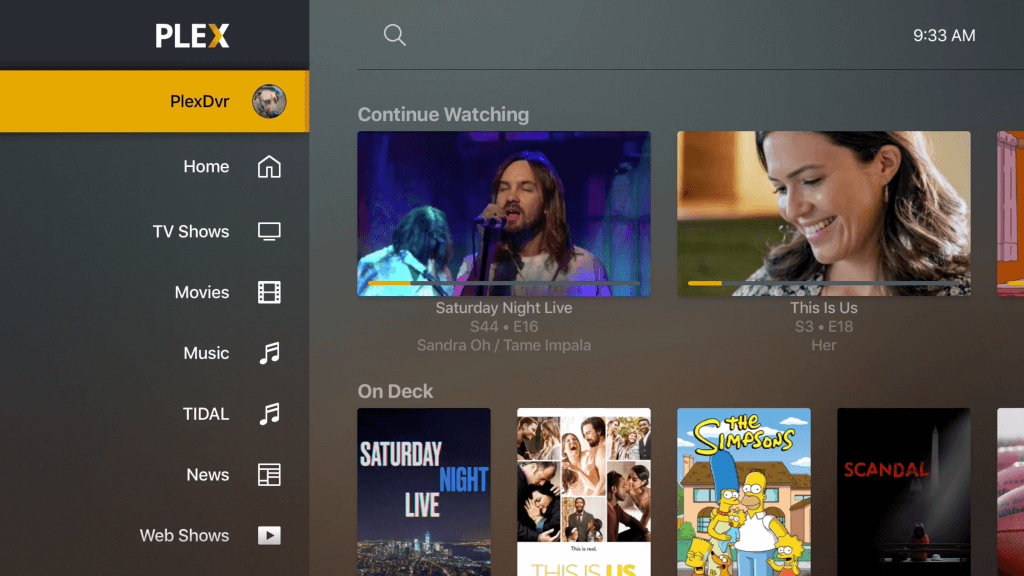
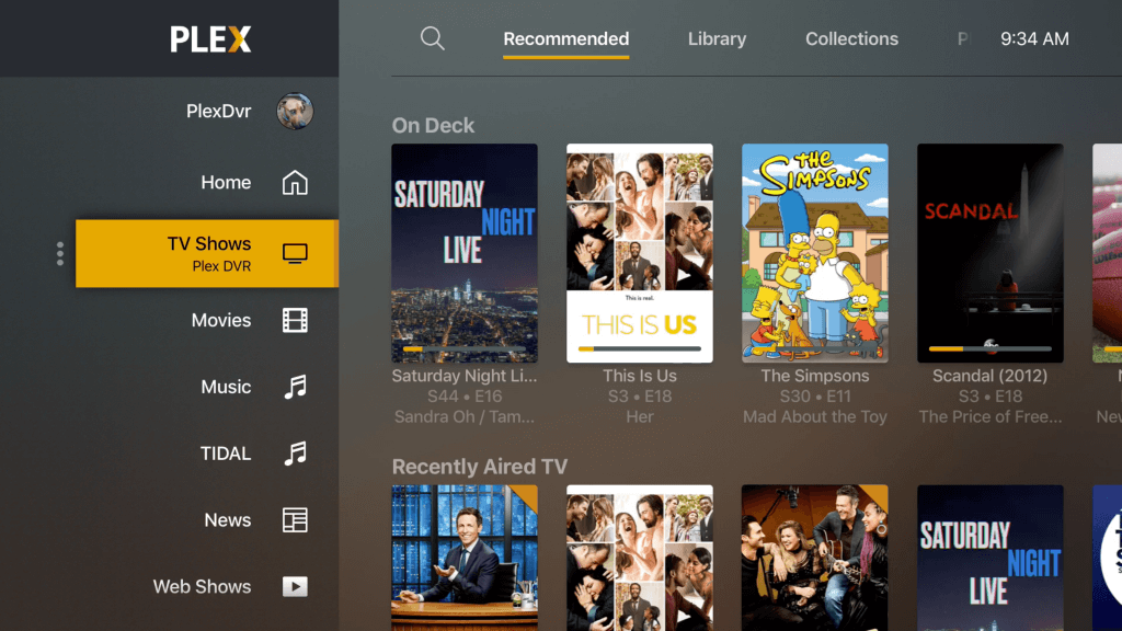
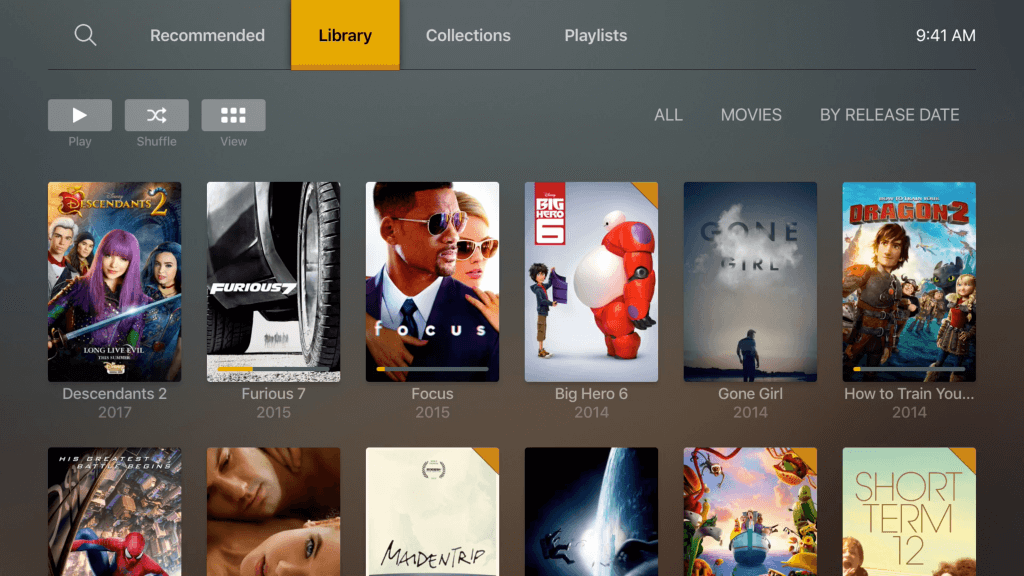

The UI in our apps has been through a few major changes in its time. These have been driven by the shifting needs of the Plex ecosystem, which has become increasingly vast and feature-rich over the years.
These transitions can be a little painful for some, and (believe us!) we do our very best to balance the needs of everyone from the most intense Plex-head running seven servers in their closet (we know you’re out there!) to your grandma or roommate who just wants to check out the odd episode of Friends from time to time (I’m told it didn’t age well). Sometimes we’ve managed to nail these transitions perfectly, and sometimes, unfortunately, we haven’t.
If you’re old enough to remember Plex’s embryonic form OSXBMC, you’ll remember those were simpler times. You plugged a hard drive into your Mac Mini, your Mini into your only TV, stuck your media on that sucker, and played away. There was no server. Our phones still had keypads. These were dark days.
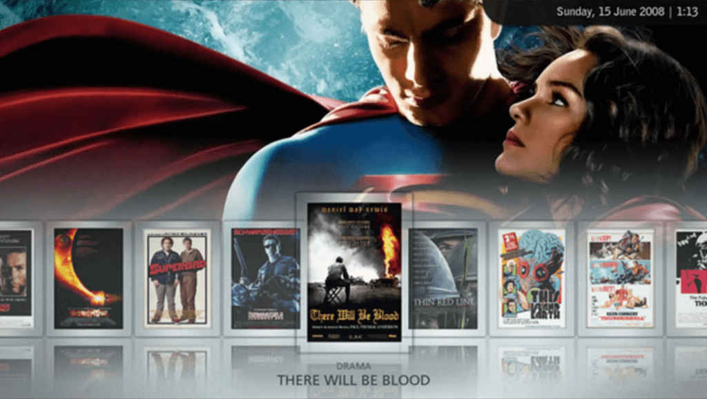
As it became clear that the Future was going to be multi-screened, we created the Plex Media Server, and turned OSXBMC into a lightweight app which could access it. There’s no question this was a Good Move, but hey, it added some complexity. We stuck with it, our lovely community of dedicated Plexians stuck with it, and I think you’ll agree we’re all better off.
When we introduced our service in the cloud (anyone remember “myPlex”?), it unlocked some pretty awesome capabilities. Now you could easily stream from anywhere, and it meant you could share your stuff with family and friends. Pretty spiffy, but our apps were built under the assumption that you had one local server available to you. Shared stuff was all sort of shoehorned off into a corner of the app, and if you wanted to browse it, you got a big flat list. Not so great. So we undertook a redesign effort that we internally thought of as “server-first”—now you could pick the server you wanted to browse, and when you did, you got a first class experience. Again, this introduced a little bit of complexity for some folks who really did have a single, local server. So it wasn’t without its tradeoffs, but again, in the end we think it was worth it.
Fast forward a few years, and we wanted to start dipping our toes in some new streams of content (see what I did there?) that we could bring to all of you wonderful folks in a first class way, as well as people who didn’t have their own server at all. We also realized that it was more likely that you’d have more server-based sources available. Both of these realities posed a challenge to our “server-first” navigation. Streaming content, of course, wasn’t coming from a traditional media server, and navigating between servers was fairly painful. In fact, why should you need to think about servers at all when you should be able to just find the thing you want and play it? (It’s an important factor, of course, but it shouldn’t get in the way.)
As a way of taming the growing number of sources, some of which lived in the cloud, we devised a UI navigation scheme that we referred to internally as “type-first”. That is, you pick the type of media you’re looking for (“I’d like to watch a movie”), then pick from a (smaller) number of sources that contain that type of media. In the end, it was well-intentioned and it solved a few things nicely for many folks, but it also introduced a great deal of friction for some. Based on all the feedback (both internal and external), we went back to the drawing board in search of a better approach.
Internally, we refer to the new effort as “UNO”, since bringing a unified, consistent experience to all platforms and devices is one of the core objectives. A few others include:
-
- Restoring some basic usability qualities that suffered a bit under “type-first”. Fewer clicks to get where you want to go. More discoverable actions and sources. More intuitive gestures and navigation. Fewer distractions with things you shouldn’t have to care about.
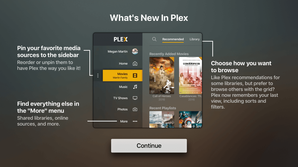
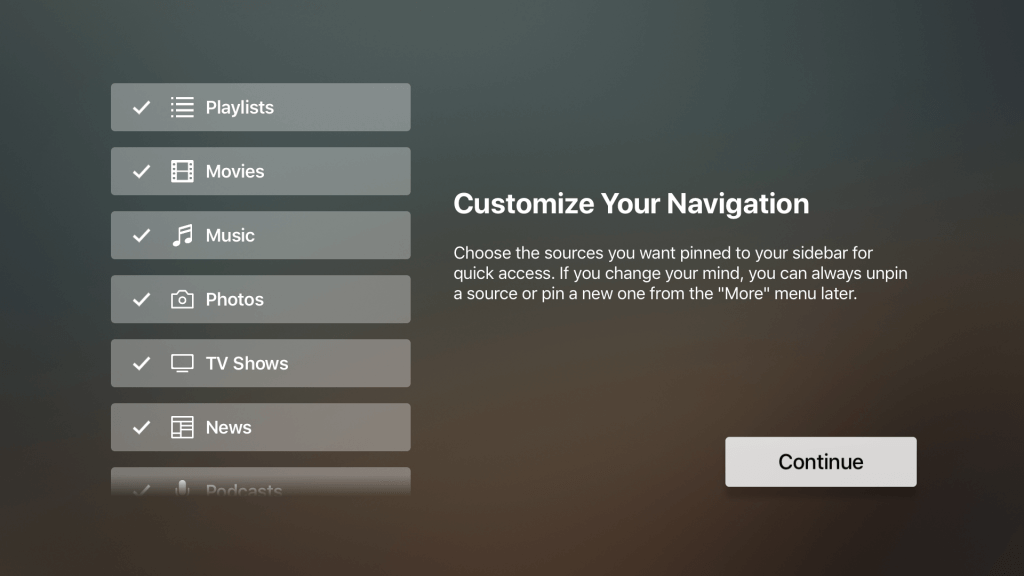
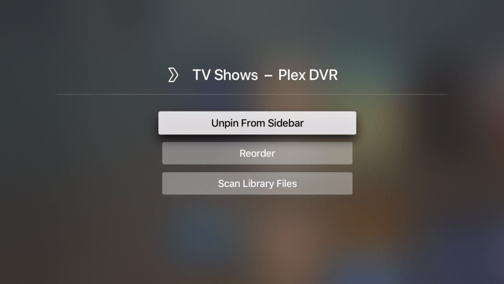
- Ownership and customization. You have complete control over your navigation—you tell Plex what you care about, we build an experience for you, and if you don’t like it, you can rearrange sources, hide sources, and more.
- Improved functionality in a multi-source world. Features like Search need to work perfectly to deliver exactly the results you want.
- At the core of the experience is the sidebar. In addition to being a better use of screen space than the top menu, it lets you see all the stuff you care about, and none of the stuff you don’t.
We hope you enjoyed this trip down memory lane, and we really hope you like “UNO” on Roku and Apple TV (and remember, we’re bringing it to other platforms). Please leave us feedback here in the comments or on the forums. Last, but not least—we hope your 2019 is off to a great start!

